INDUSTRY: Education & Technology
CLIENT: TutorPal
YEAR: 2024
EXPERIENCE: Branding & Visual Identity

TutorPal
An alternate direction we explored for TutorPal. It may not the final choice, but it’s one of my favorites.
about.
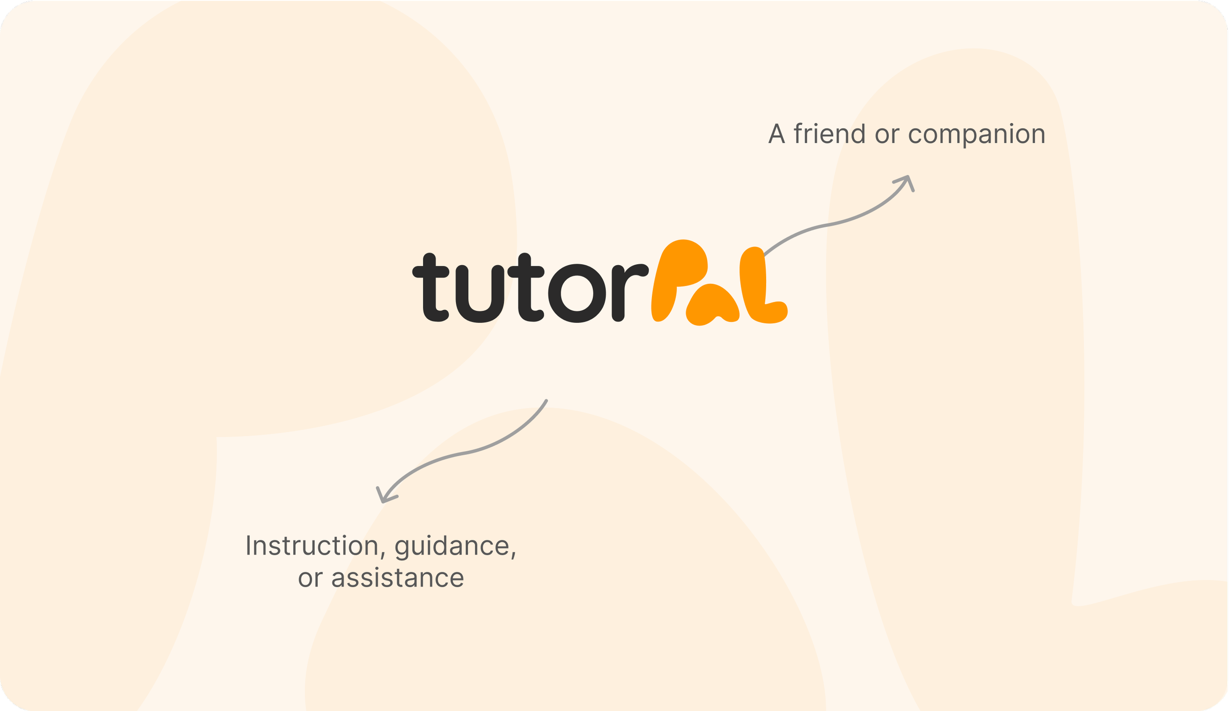
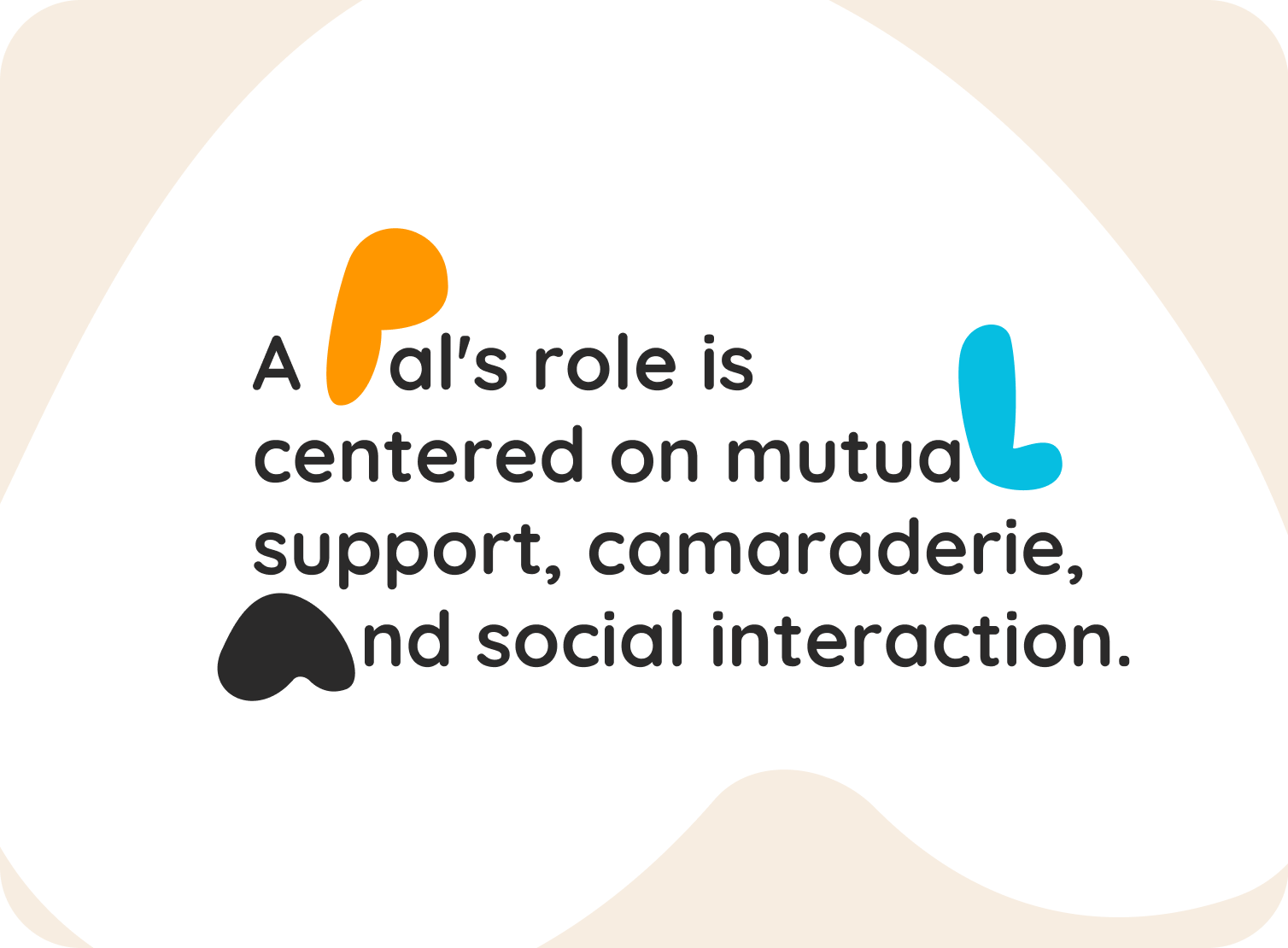
TutorPal is an education technology brand built around the idea of guidance and companionship in learning. The name itself combines two key concepts: “Tutor” (instruction, guidance, and support) and “Pal” (a friend, companion, or peer).
Together, they reflect a platform that makes online tutoring feel approachable, supportive, and human.
challenge.
Our challenge was to design a brand identity that balances professional credibility with warmth and friendliness. The visual system draws inspiration from real study experiences such as notes, highlights, and annotations; elements that tutors often use to make learning stick.
the logo
A playful logotype where “Pal” is highlighted in a bright, friendly orange to symbolize energy, trust, and approachability.
typography & color
Rounded, modern typefaces paired with a vibrant yet balanced palette to appeal to both students and parents.
visual storytelling
Shapes and annotations that represent collaboration, guidance, and the human touch behind technology.
brand strategy
Positioning TutorPal not just as a service, but as a supportive companion in a student’s educational journey.

ilai’s notes.
While this direction wasn’t the final choice, it remains one of my favorite explorations for TutorPal. The concept captured the brand’s essence of guidance, companionship, and approachable learning in a way that felt both playful and professional.
The identity leaned into annotation-inspired visuals—scribbles, highlights, and notes—that symbolized how tutors simplify learning for students. Combined with a friendly logo mark and warm color palette, this alternate concept delivered a brand that was trustworthy, approachable, and memorable.
Even as an unused version, it reflects the kind of story-driven, strategic branding that connects with students and parents in the online tutoring industry.
View the approved version of TutorPal