INDUSTRY: Education & EdTech
CLIENT: Examy
YEAR: 2023
EXPERIENCE: Brand Identity & Messaging

Examy
about.
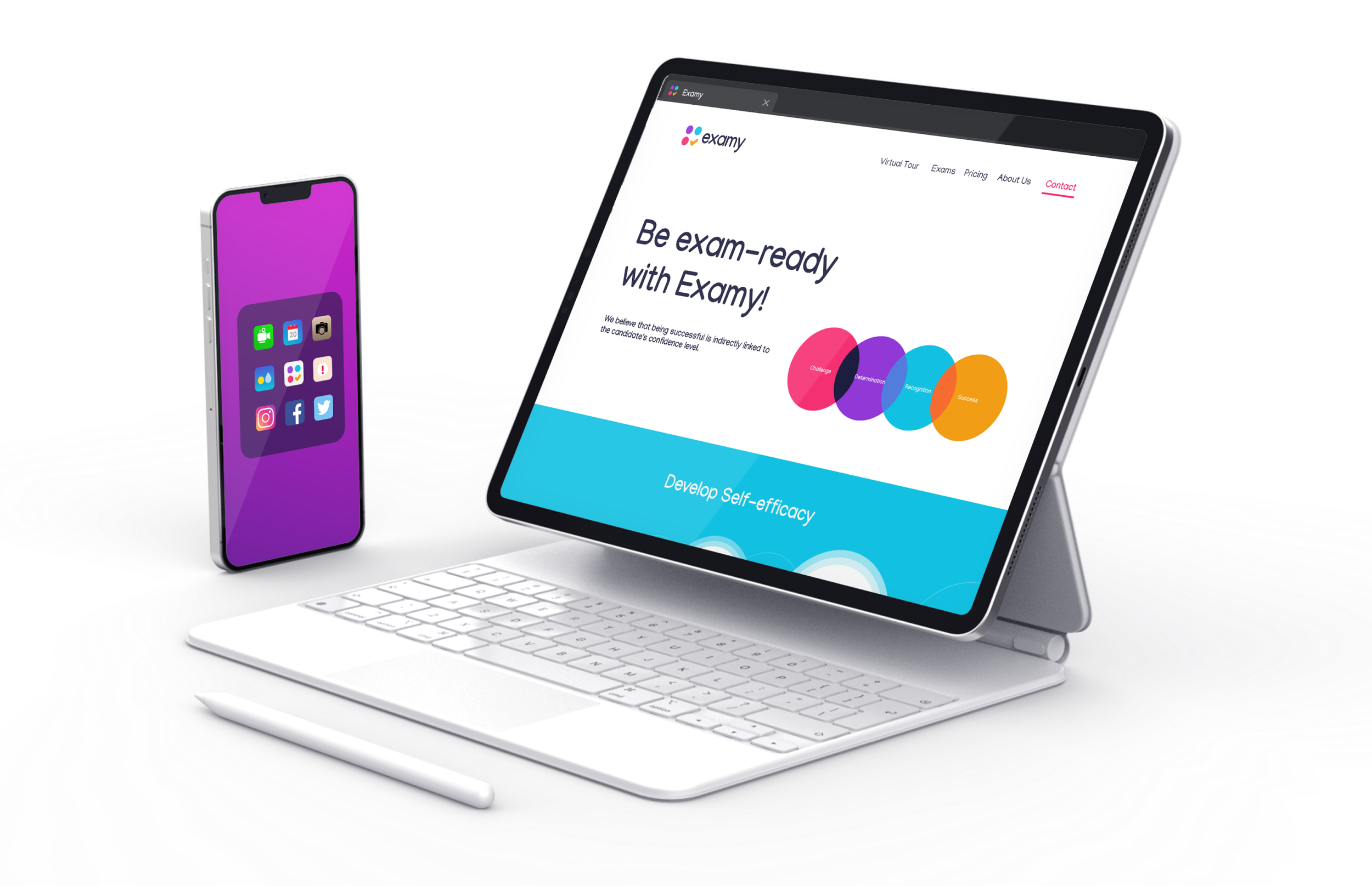
Exam preparation can be overwhelming for students who aspire to get into top schools or secure higher opportunities. Examy was created to change that—helping students be exam-ready with confidence, clarity, and the right tools.
our goal.
Our goal was to design a brand identity that feels motivating, modern, and empowering. The brand had to resonate with students under pressure, while also being trustworthy and aspirational.
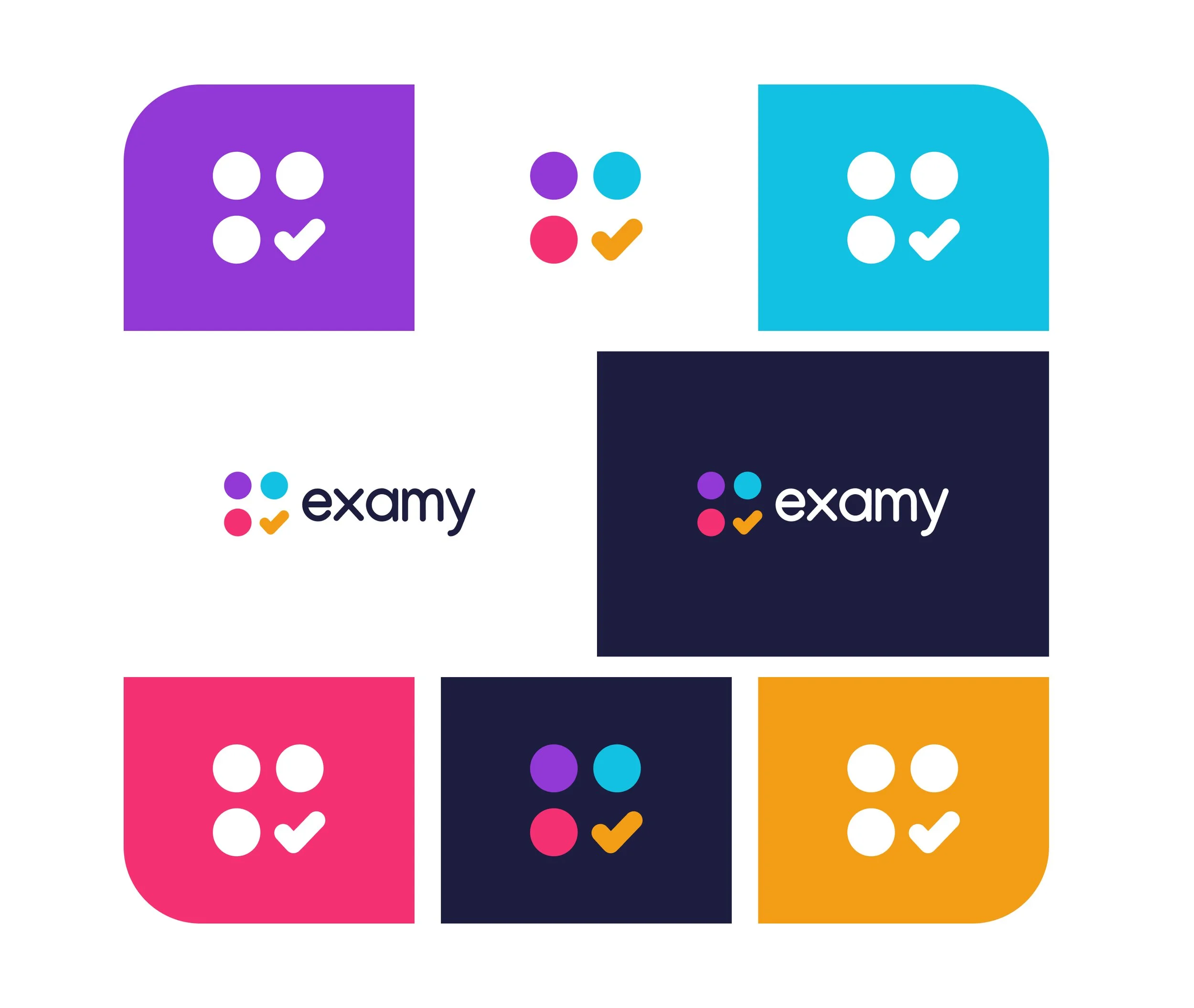
the logo
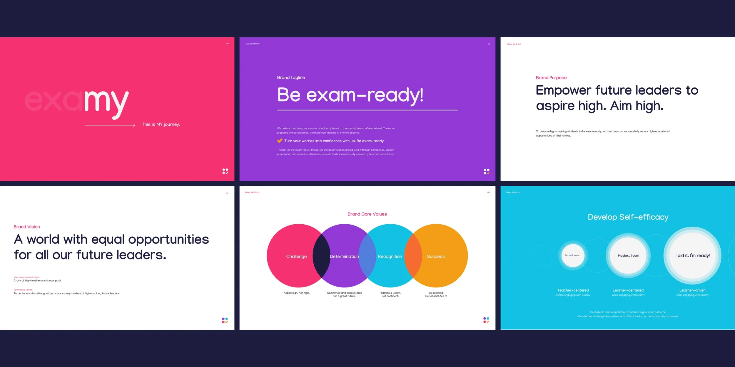
The wordmark highlights “my” in Examy, emphasizing that exams are a personal journey: This is MY path. This is MY future.
typography & color
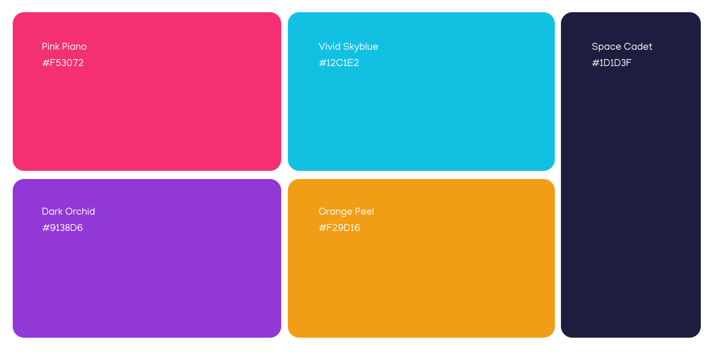
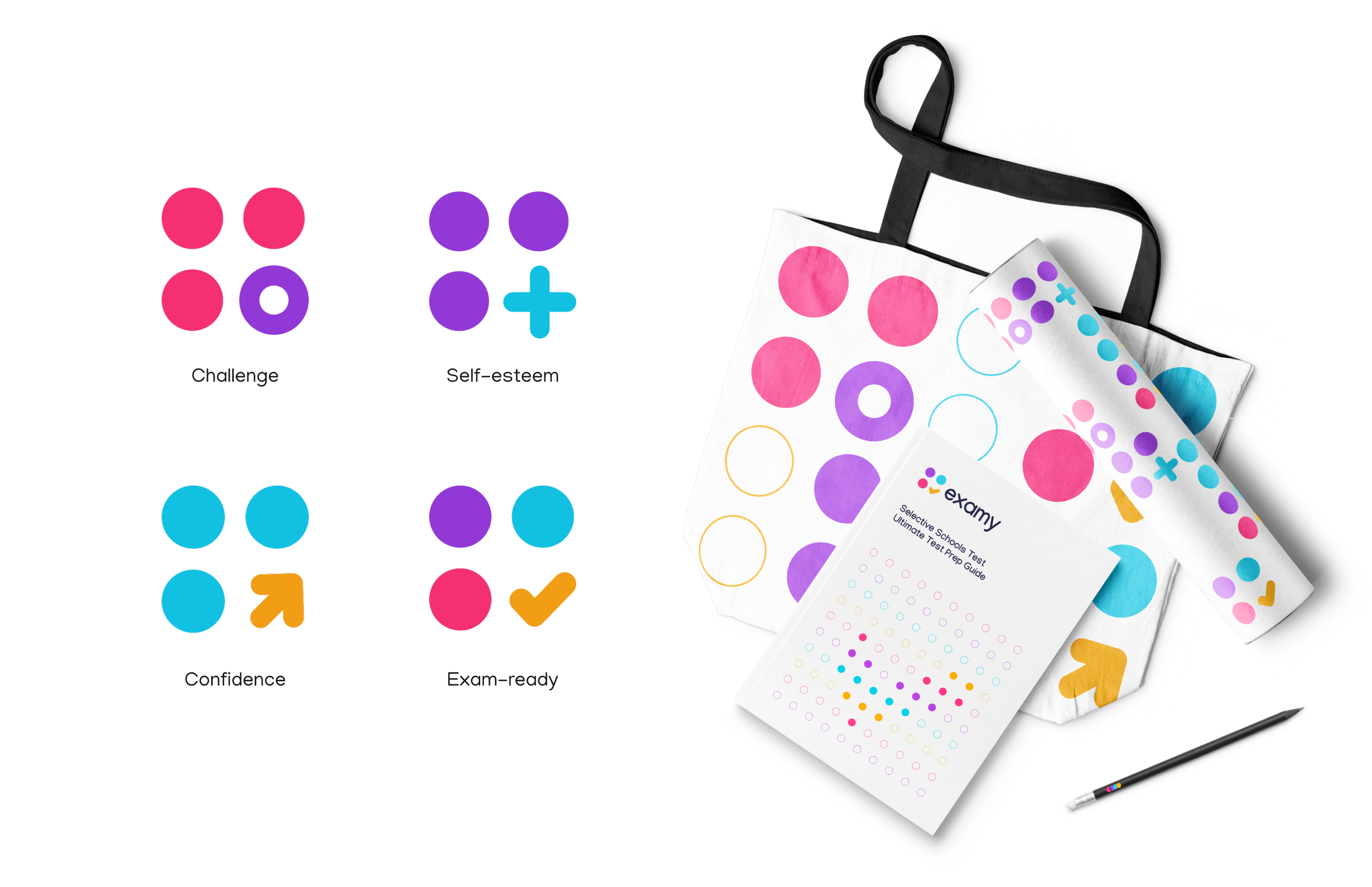
Bold, modern typefaces paired with a vibrant palette of pink, purple, orange, and blue—each representing challenge, determination, recognition, and success.
visual storytelling
The brand uses circles and dynamic gradients to represent growth and self-efficacy—from uncertainty to readiness: “I’m not sure… Maybe I can… I did it. I’m ready!”
brand strategy
Positioning Examy as more than just a platform—it’s a confidence-builder. The strategy empowers students to see exams not as obstacles, but as stepping stones to bigger opportunities.
results.
The final identity positions Examy as a bold, supportive, and future-focused edtech brand. With a vibrant visual system and empowering messaging, the brand communicates one clear promise: Be exam-ready.